
Can’t Stand Windows File Explorer? Try This 40k-Star Open-Source Alternative.
Windows File Explorer has been around for nearly 30 years, and its core experience has hardly changed. Want to view two folders at once? Open two windows and switch back and forth. Want to tag files for organization? No such feature. Want multiple tabs? Windows 11 finally added them, but they’re clunky and awkward.
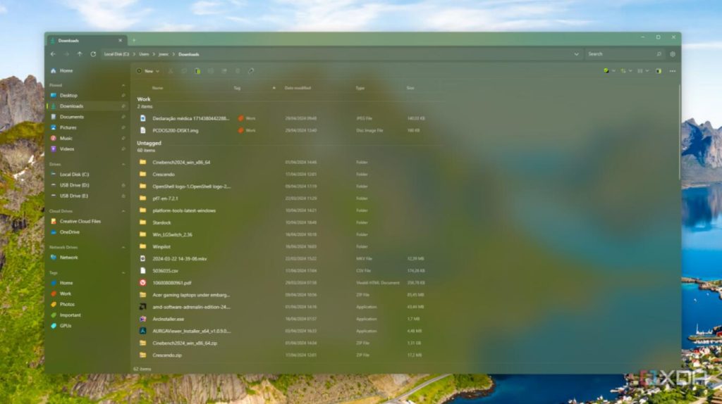
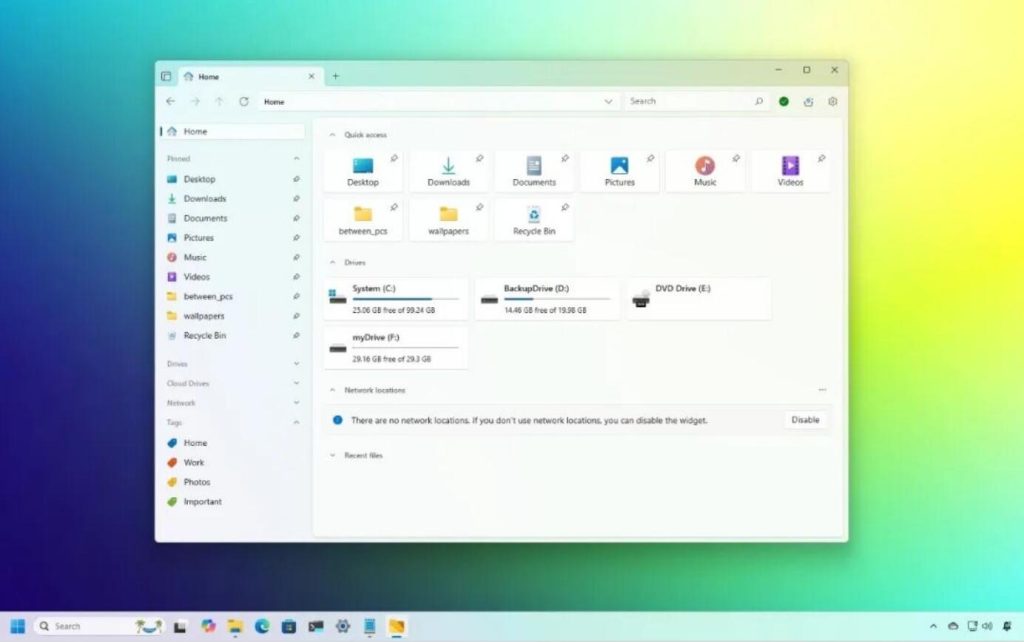
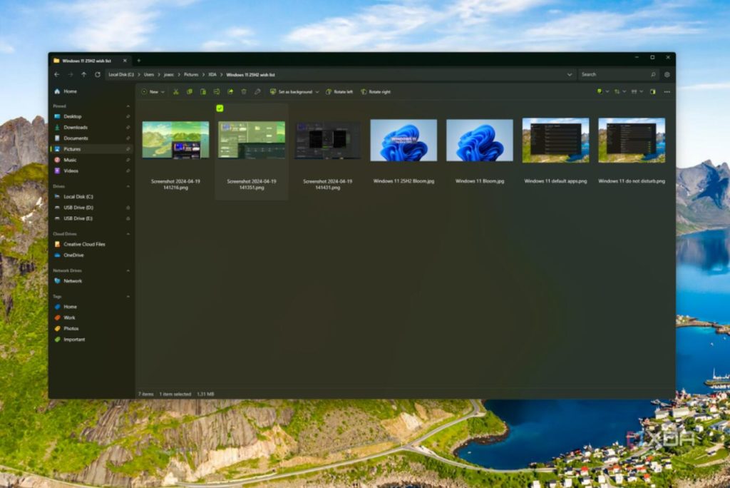
An open-source project on GitHub, with 43,000 stars, has done what Microsoft hasn’t: redesigned a modern file manager from the ground up. It’s called Files, and it looks like this:
[Image placeholder: Imagine a clean, modern file manager with a tabbed interface, dual-pane view, and color tags.]
The difference is immediately apparent—clean, modern, uncluttered. It uses Microsoft’s own Fluent Design language, looking more “official” than Microsoft’s own file manager.
What problems does it solve?
- Tabs, Finally Done Right. Browser-like tab experience—Ctrl+T to open a new tab, Ctrl+W to close, drag to reorder, middle-click to close. No more opening a bunch of windows. Windows 11 added tabs, but the logic is awkward, and closing the window closes all tabs. Files’ tabs feel just like a browser’s; once you try it, you can’t go back.
- Dual-Pane View, No More Switching for File Copies. One folder on the left, another on the right, drag and drop directly. Organizing files, archiving data, migrating—efficiency doubles. Total Commander had this for ages, but its interface is ancient. Files combines good looks with great usability.
- File Tags—Finally, a Way to Categorize Files. This is the most delightful feature. You can assign color tags to any file or folder, e.g.:
- 🔴 Urgent / Pending
- 🟡 In Progress
- 🟢 Completed
- 🔵 Reference Material No need to rename files or create subfolders; just mark them directly. Combined with search and sorting, file management reaches a new level.
- Other Useful Details:
- Column Layout Customization: Freely choose which columns to display (size, date, type, etc.).
- Cloud Drive Integration: OneDrive, Google Drive, etc., show sync status directly.
- Git Status Display: Developer-friendly; shows modification status for folders with Git repos.
- Context Menu: More sensible than Windows 11’s default simplified right-click menu.
- Dark Mode: Follows the system, pure black/deep gray options.
Comparison with Default Windows Explorer
| Feature | Windows Explorer | Files App |
|---|---|---|
| Tabs | Present but clunky | Browser-grade experience |
| Dual-Pane View | Not available | Natively supported |
| File Tags | Not available | Color tag categorization |
| UI Design | Mixed styles | Unified Fluent Design |
| Customization Level | Low | High (Layout/Theme/Actions) |
| Performance | Fast | Slightly slower (in huge folders) |
There is one drawback: in folders with a massive number of files (tens of thousands or more), loading can be slightly slower than the default explorer. In daily use, you won’t notice a difference. But if you frequently handle enormous folders, you can use both tools together.
How to install?
- Simplest way: Open the Microsoft Store, search for “Files App”, and install directly.
- Command Line:
winget install "Files" - GitHub Download: Search for
files-community/Files, download the latest version from Releases.
After installation, you can set it as the default file manager in its settings, replacing the system default. If you don’t want to replace it, they can coexist without conflict.
Final Thoughts
Windows File Explorer hasn’t seen a major overhaul in 30 years; Microsoft clearly thinks it’s good enough. But 43,000 GitHub stars prove users disagree. Tabs, dual-pane, file tags—these should be system features, but the community has filled the gap. It’s free, open-source, and available on the Microsoft Store. Try it for a week; you probably won’t want to switch back.
- 🌐 Website: files.community
- 📦 GitHub: github.com/files-community/Files
- 💻 Requirements: Windows 10 / Windows 11

